What about your project was most successful?
The part about my project that was most successful to me would probably be the redesigning of the logos. Even though in the end I had to choose between 50 logos I still had a lot of fun brainstorming my logo ideas. As I still wanted the Kinder Surprise to have a childish feel when looking at it I wanted it to be suitable for an older person at the same time.
What about your project was least successful?
Probably the part that was least succesful was coming up with what logo I wanted to rebrand. As that is what took a lot of my time. I couldn't decide what to do but then I just came across the Kinder surprise logo and first I thought it was already pretty decent looking I really had to think how I wanted to make it look better.
How did you manage your time during the project?
I would say my work was pretty consistent as when I did miss a day posting I tried to post more then two blogs the next time. Although coming up with the 50 logos did take most of the time I feel I did a good job with the time I spent on them.
What would you change about your work?
If I could change one thing about my work it would probably be the way I did the logos I ended up using paint instead I would of rather made them free hand as I like the way they look when there drawn out. But then again that does take a lot longer then doing it on the computer.
What mark do you believe you have earned on the project?
I would be happy with a mark around the 70s so 70% as I did a story board instead of a commercial.
Monday, 13 June 2011
Sunday, 12 June 2011
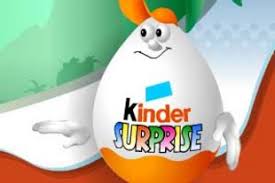
Final Logo
- Black, mustard yellow and red
- large K to keep some similarity to the old logo
- pattern between switching the colours gives it a fun look
- Cracking between the kinder and surprise


Colour

H:238 R:237 S:205
G:28 L:125 B:26

H:31 R:225 S:240
G: 201 L:127 B:14

H 160 R:0 S:0
G:0 L:0 B:0
I chose three colours that I new I would use throughout the whole logo. As these are the three colours in the German flag I thought it made sense to incorporate those colours, especially since the German word Kinder (meaning child) is used.
Characteristics
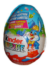
The Kinder SURPRISE logo will definitely still have that childish feel when you look at it but it will look a little more updated as I am changing the font and colour. Since the Kinder SURPRISE originated in 1972 in Italy as Kinder Sorpresa. The German word "Kinder" which came from a Kinder Chocolate("Kinderschokolade") to the German market, and in 1968 that product was introduced to Ferrero's native Italy, establishing the "Kinder" brand there, prior to the introduction of the Kinder Sorpresa chocolate eggs. I thought it would be cool to incorporate the colours of Germany into the logo.

Pitch
Since Kinder SURPRISE is considered to be more for a younger age I am still trying to make it suitable to fit any age as many adults enjoy a "surprise" once in a while. And I am really trying to incorporate Germany a little as well due to the word "Kinder" it seems just right!
Good Brand
CHANEL is probably one of the most recognizable and successful brand in the fashion industry. The logo is very chique looking and all around has a very sophisticated look towards it.

Subscribe to:
Posts (Atom)